JOHN ROGERS, SENIOR ENERGY ANALYST, CLEAN ENERGY | SEPTEMBER 13, 2018, 11:49 AM EST
View the original article here.
The latest annual report on large-scale solar in the U.S. shows that prices continue to drop. Solar keeps becoming more irresistible.
The report, from Lawrence Berkeley National Laboratory (LBNL) and the US Department of Energy’s Solar Energy Technologies Office, is the sixth annual release about the progress of “utility-scale” solar. For these purposes, they generally define “utility-scale” as at least 5 megawatts (three orders of magnitude larger than a typical residential rooftop solar system). And “solar” means mostly photovoltaic (PV), not concentrating solar power (CSP), since PV is where most of the action is these days.
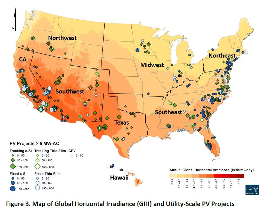
Here’s what the spread of large-scale solar looks like:
In all, 33 states had solar in the 5-MW-and-up range in 2017—four more than had it at the end of 2016. [For a cool look at how that map has changed over time, 2010 to 2017, check out this LBNL graphic on PV additions.]
Watch for falling prices
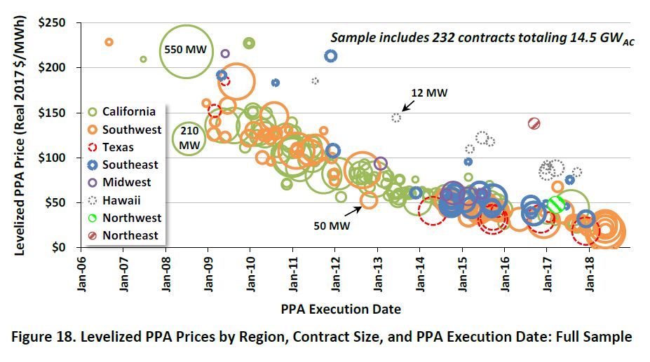
Fueling—and being fueled by—that growth are the reductions in costs for large-scale projects. Here’s a look at power purchase agreements (PPAs), long-term agreements for selling/buying power from particular projects, over the last dozen years:
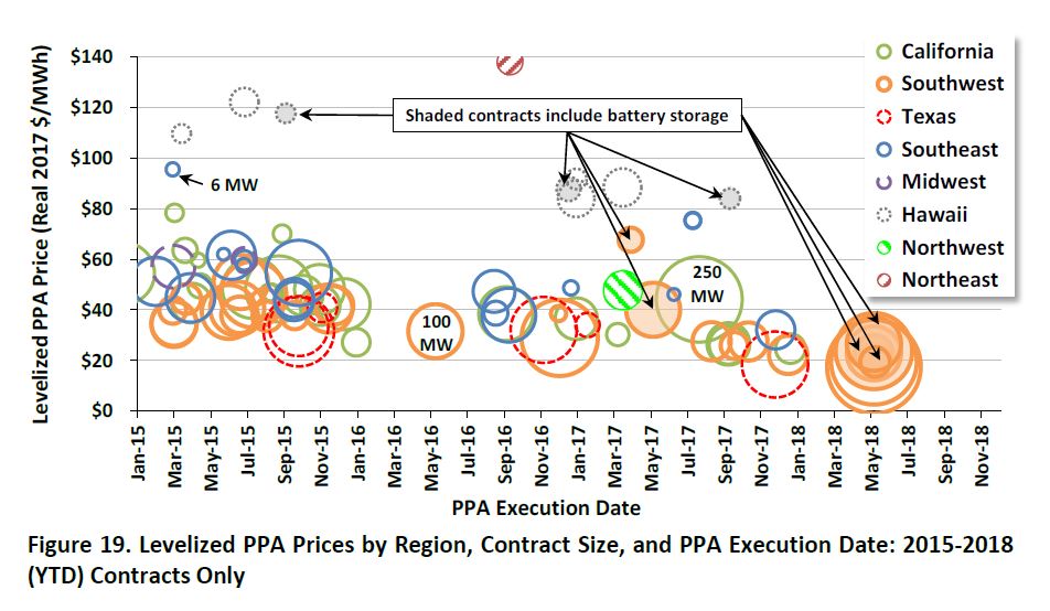
And here’s a zoom-in on the last few years, broken out by region:
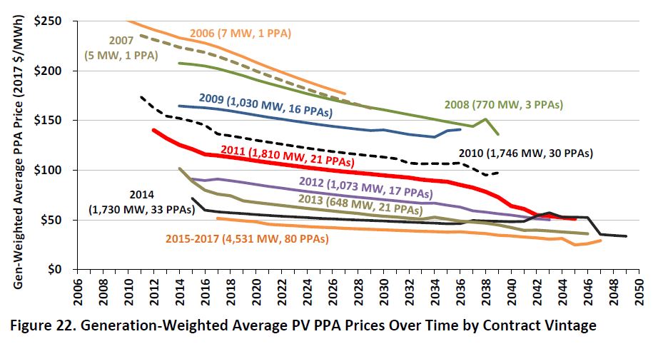
While those graphs show single, “levelized” prices, PPAs are long-term agreements, and what happens over the terms of the agreements is worth considering. One of the great things about solar and other fuel-free electricity options is that developers can have a really good long-term perspective on future costs: no fuel = no fuel-induced cost variability. That means they can offer steady prices out as far as the customer eye can see.
And, says LBNL, solar developers have indeed done that:
Roughly two-thirds of the contracts in the PPA sample feature pricing that does not escalate in nominal dollars over the life of the contract—which means that pricing actually declines over time in real dollar terms.
Imagine that: cheaper over time. Trying that with a natural gas power plant would be a good way to end up on the losing side of the contract—or to never get the project financed in the first place.
Here’s what that fuel-free solar steadiness can get you over time, in real terms:
What’s behind the PPA prices
So where might those PPA price trends be coming from? Here are some of the factors to consider:
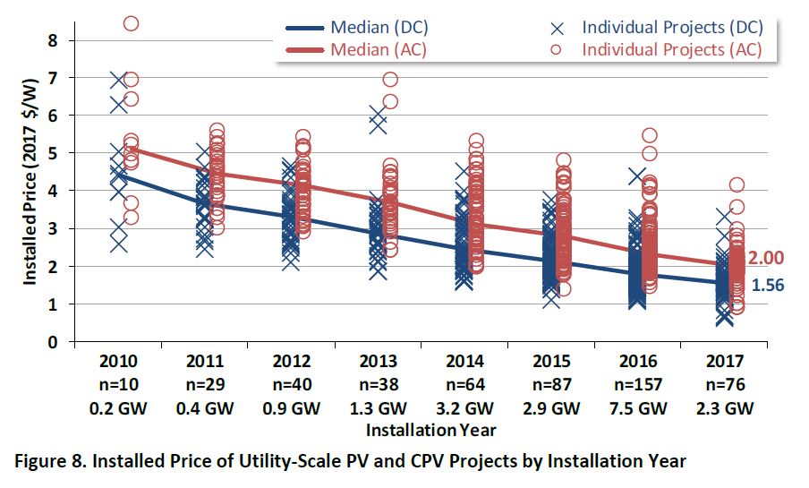
Equipment costs. Solar equipment costs less than it used to—a lot less. PPAs are expressed in cost per unit of electricity (dollars per megawatt-hour, or MWh, say), but solar panels are sold based on cost per unit of capacity ($ per watt). And that particular measure for project prices as a whole also shows impressive progress. Prices dropped 15% just from 2016 to 2017, and were down 60% from 2010 levels.
The federal investment tax credit (30%) is a factor in how cheap solar is, and has helped propel the incredible increases in scale that have helped bring down costs. But since that ITC has been in the picture over that whole period, it’s not directly a factor in the price drop.
Project economies of scale. Bigger projects should be cheaper, right? Surprisingly, LBNL’s analysis suggests that, even if projects are getting larger (which isn’t clear from the data), economies of scale aren’t a big factor, once you get above a certain size. Permitting and other challenges at the larger scale, they suggest, “may outweigh any benefits from economies of scale in terms of the effect on the PPA price.”
Solar resource. Having more of the solar happen in sunnier places would explain the price drop—more sun means more electrons per solar panel—but sunnier climes are not where large-scale solar’s growth has taken it. While a lot of the growth has been in California and the Southwest, LBNL says, “large-scale PV projects have been increasingly deployed in less-sunny areas as well.” In fact:
In 2017, for the first time in the history of the U.S. market, the rest of the country (outside of California and the Southwest) accounted for the lion’s share—70%—of all new utility-scale PV capacity additions.
The Southeast, though late to the solar party, has embraced it in a big way, and accounted for 40% of new large-scale solar in 2017. Texas solar was another 17%.
But Idaho and Oregon were also notable, and Michigan was one of the four new states (along with Mississippi, Missouri, and Oklahoma) in the large-scale solar club. (And, as a former resident of the great state of Michigan, I can attest that the skies aren’t always blue there—even if it actually has more solar power ability than you might think.)
Capacity factors. More sun isn’t the only way to get more electrons. Projects these days are increasingly likely to use solar trackers, which let the solar panels tilt face the sun directly over the course of the day; 80% of the new capacity in 2017 used tracking, says LBNL. Thanks to those trackers, capacity factors themselves have remained steady in recent years even with the growth in less-sunny locales.
What to watch for
This report looks at large-scale solar’s progress through the early part of 2018. But here are a few things to consider as we travel through the rest of 2018, and beyond:
- The Trump solar tariffs, which could be expected to raise costs for solar developers, wouldn’t have kicked in in time to show up in this analysis (though anticipation of presidential action did stir things up even before the tariff hammer came down). Whether that signal will clearly show in later data will depend on how much solar product got into the U.S. ahead of the tariffs. Some changes in China’s solar policies are likely to depress panel prices, too.
- The wholesale value of large-scale solar declines as more solar comes online in a given region (a lot of solar in the middle of the day means each MWh isn’t worth as much). That’s mostly an issue only in California at this point, but something to watch as other states get up to high levels of solar penetration.
- The investment tax credit, because of a 2015 extension and some favorable IRS guidance, will be available to most projects that get installed by 2023 (even with a scheduled phase-down). Even then it’ll drop down to 10% for large-scale projects, not go away completely.
- Then there’s energy storage. While the new report doesn’t focus on the solar+storage approach, that second graphic above handily points out the contracts that include batteries. And the authors note that adding batteries doesn’t knock things completely out of whack (“The incremental cost of storage does not seem prohibitive.”).
And, if my math is correct, having 33 states with large-scale solar leaves 17 without. So another thing to watch is who’s next, and where else growth will happen.
Many of the missing states are in the Great Plains, where the wind resource means customers have another fabulous renewable energy option to draw on. But solar makes a great complement to wind. And the wind-related tax credit is phasing out more quickly than the solar ITC, meaning the relative economics will shift in solar’s favor.
Meanwhile, play around with the visualizations connected with the new release (available at the bottom of the report’s landing page), on solar capacity, generation, prices, and more, and revel in solar’s progress.
Large-scale solar is an increasingly important piece of how we’re decarbonizing our economy, and the information in this new report is a solid testament to that piece of the clean energy revolution.

